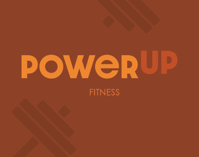
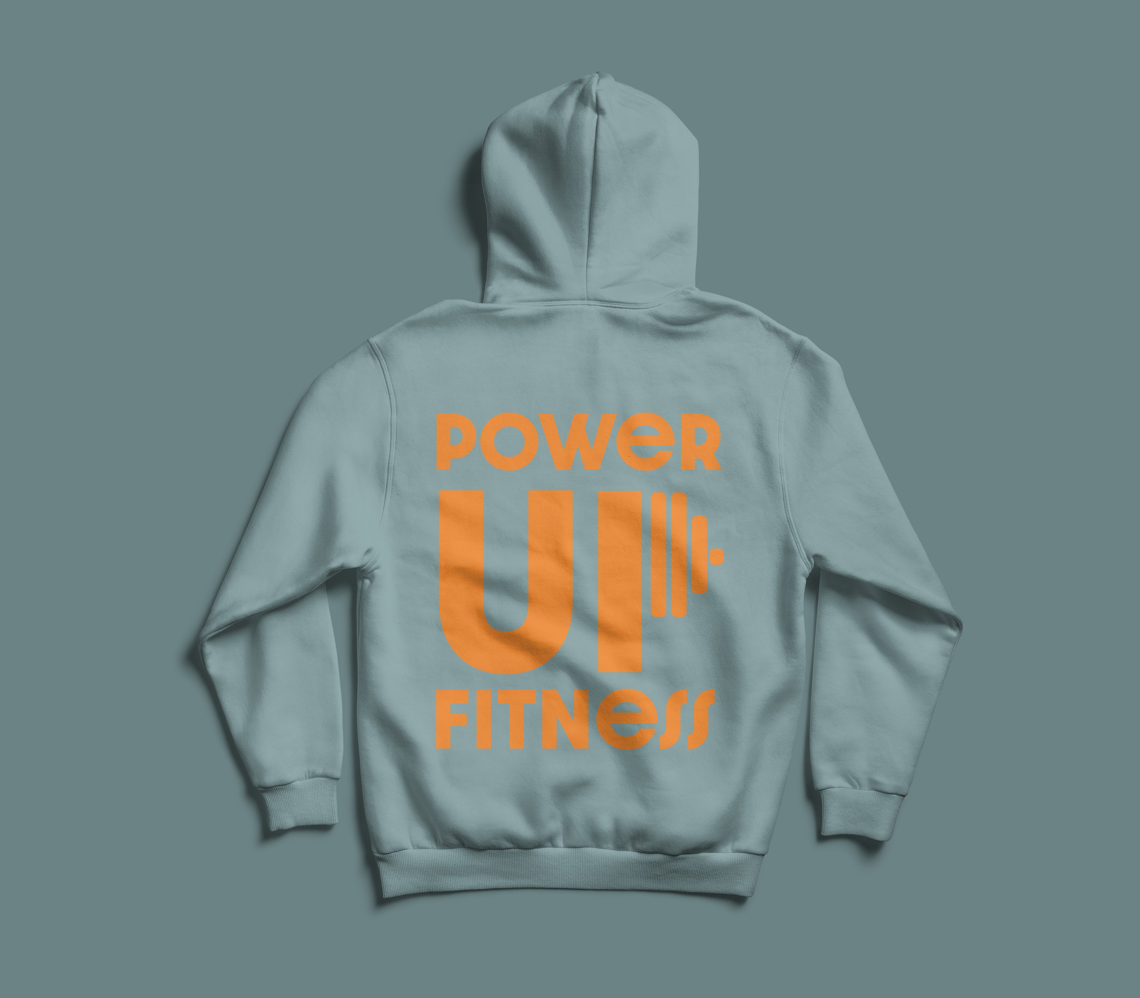
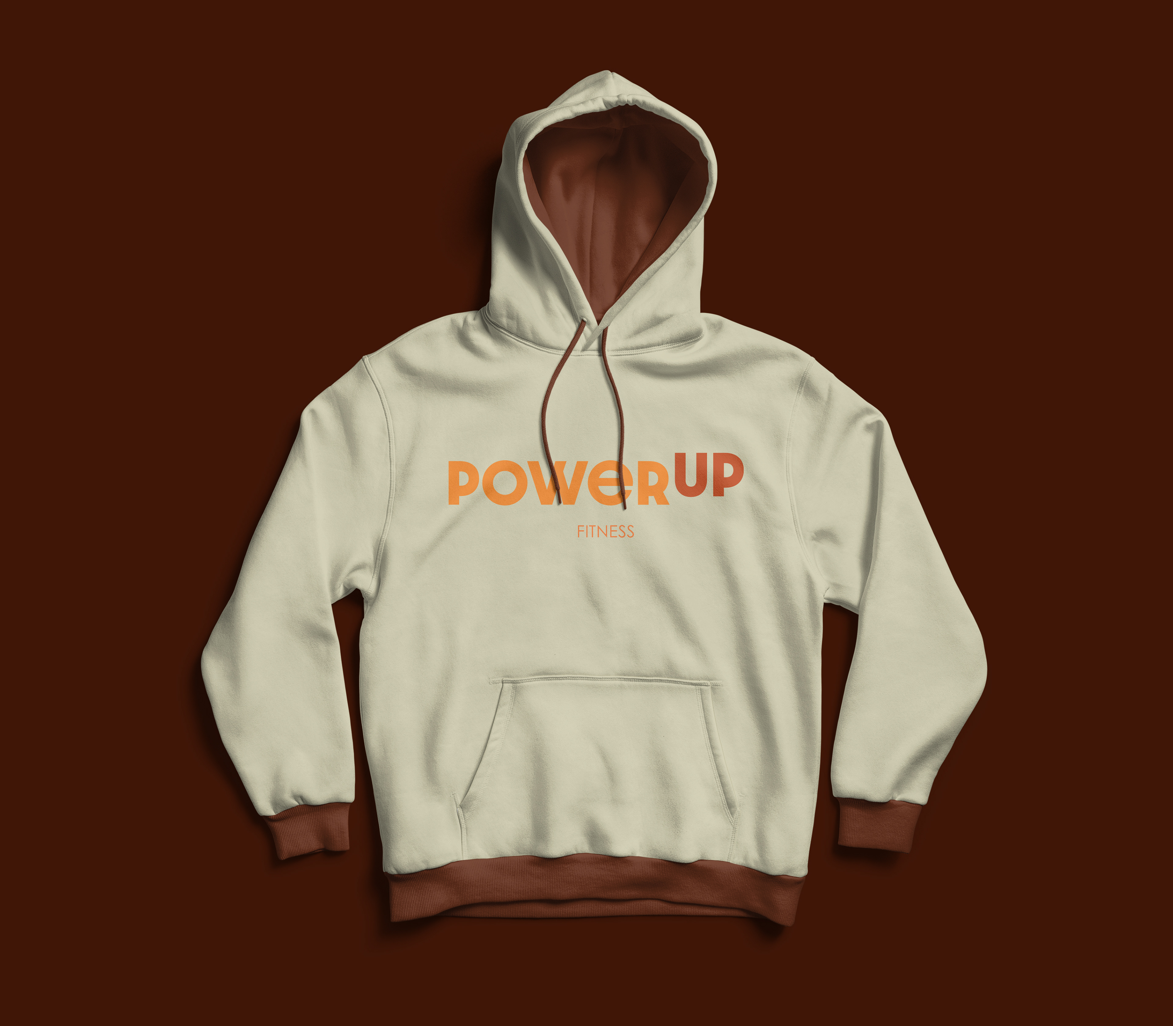
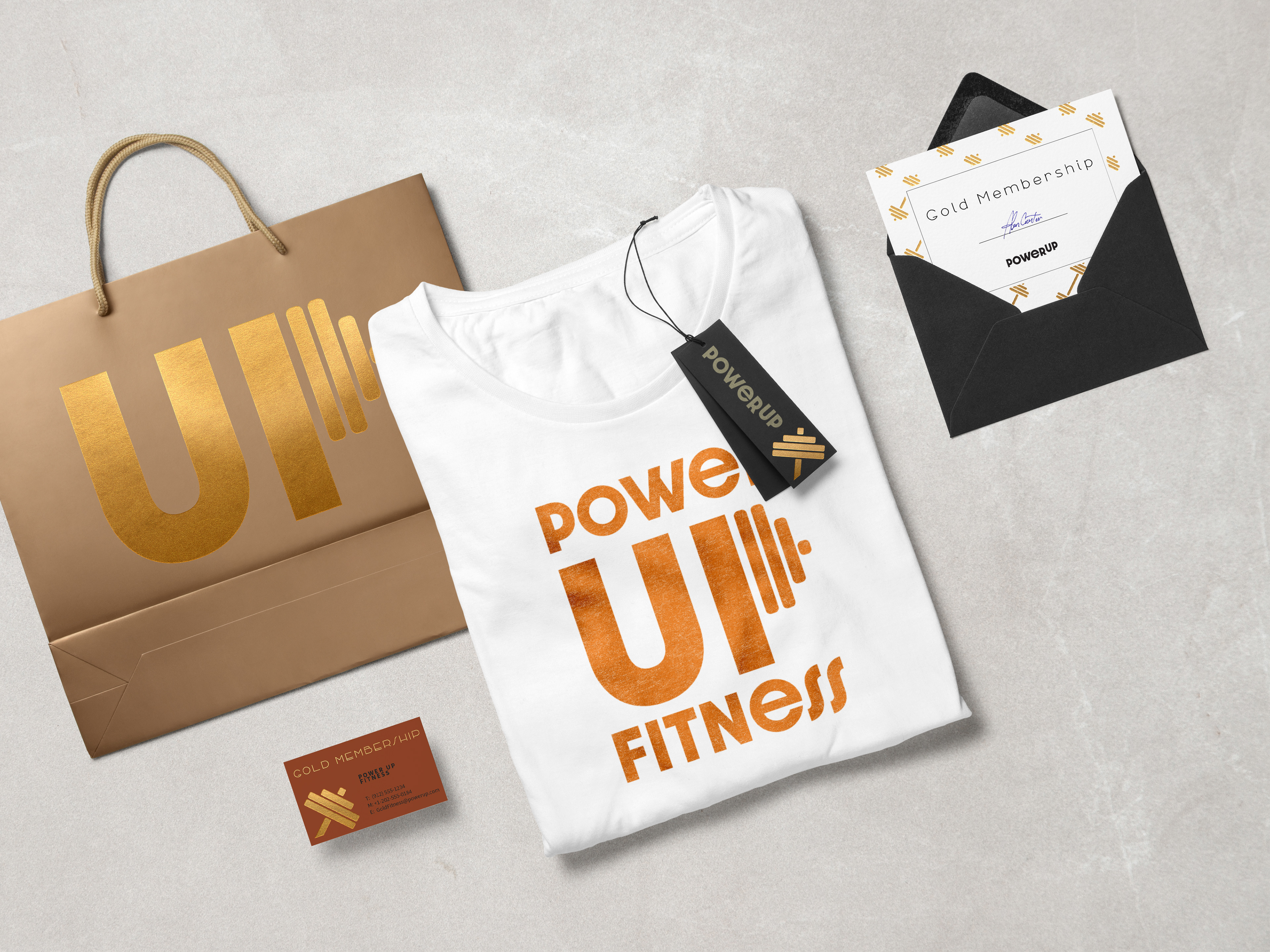
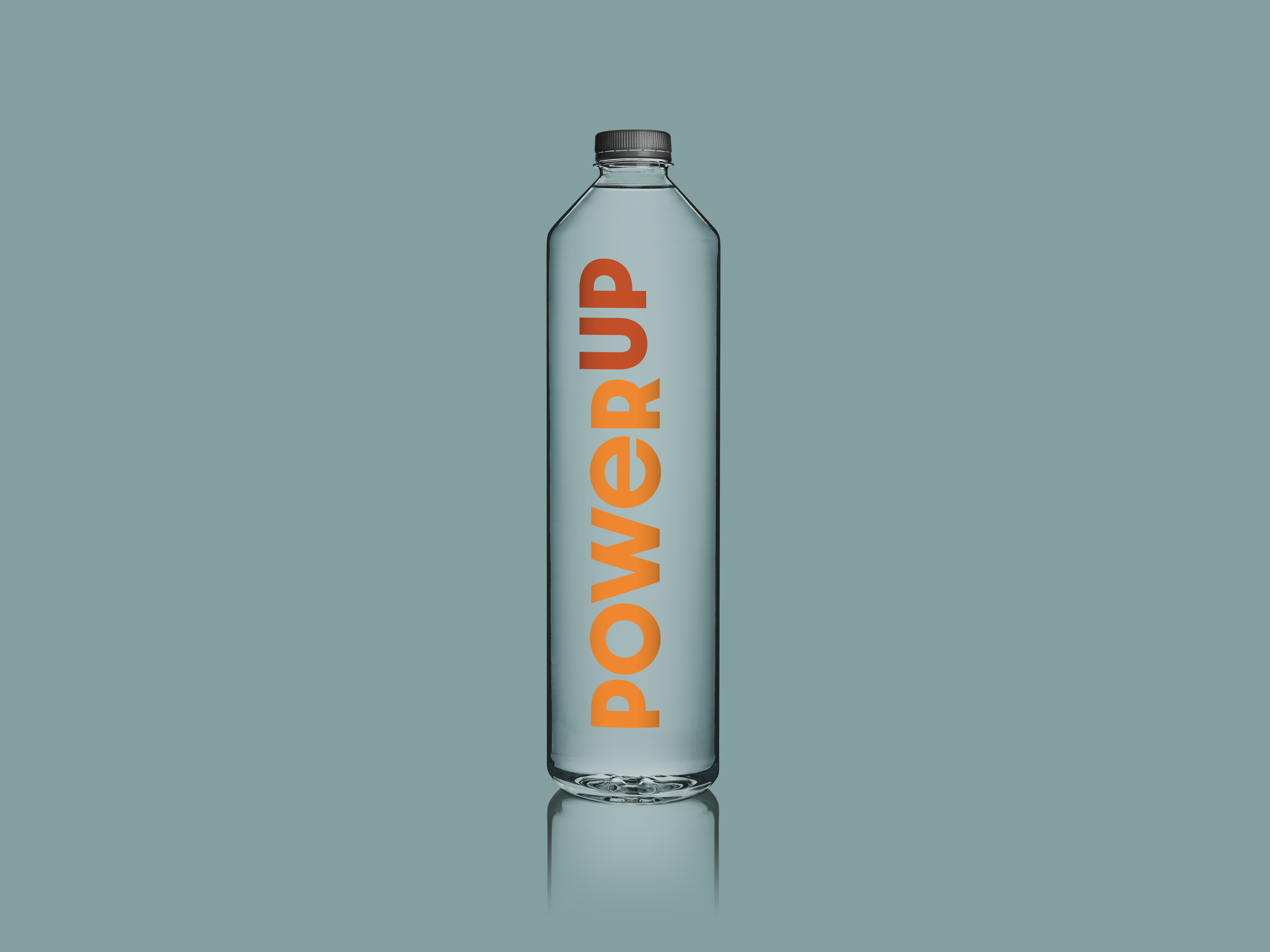
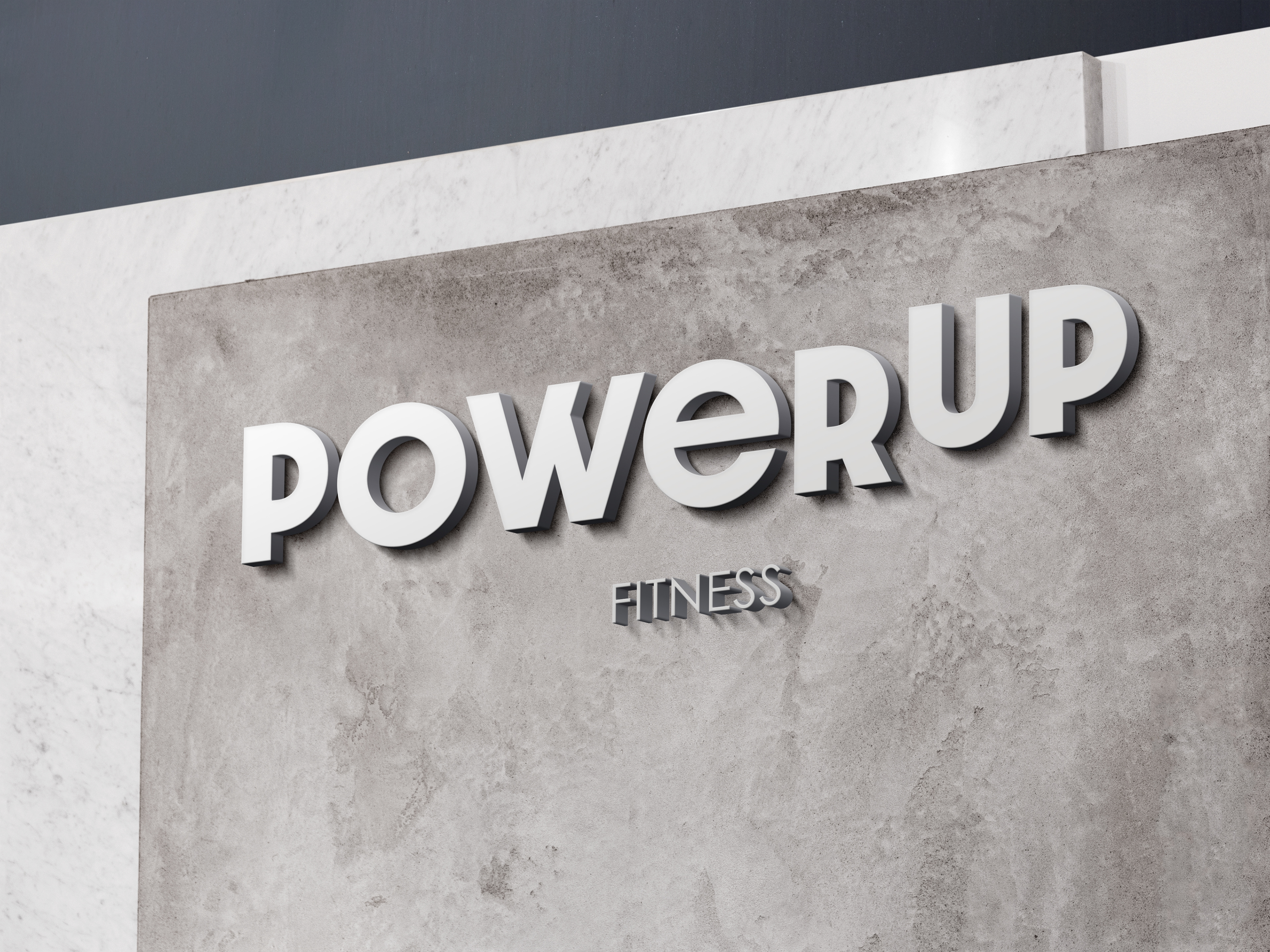
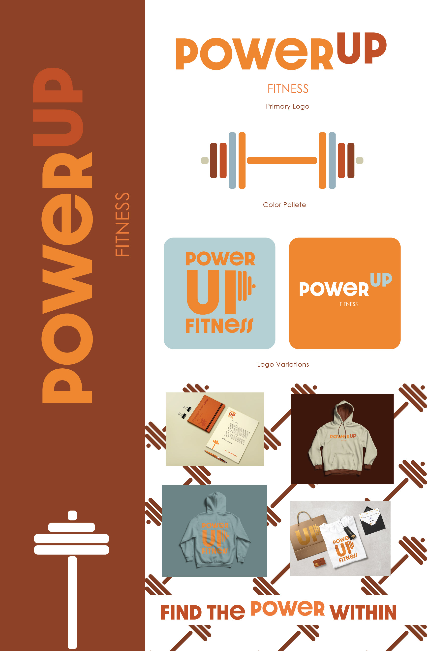
PowerUp is a modern and fun approach to fitness brand design. PowerUp offers a high-end training and fitness experience to their Members. The purpose of this logotype is to come across as sleek, modern and friendly. The visual play on words with the word "Up" literally higher than the rest adds character and a playfulness to the logo.
The sharp, mono-weight, san serif font used here is visually aggressive and strong. It almost calls the viewer to get active! I went with a complementary orange and blue toned color pallete here. The contrast of the colors feels intense, but the muted light blue and rust orange bring balance and sophistication.